Note: The client's name and identifying details (company name, domain, real client names mentioned in results) are withheld at their request. The work described below is real, drawn from project records. Some images in this case study are recreated or adapted rather than unedited originals, specifically where an unedited original would expose details withheld at the client's request. The applied pieces described below are not shown, for the same reason.
Employment title: Graphic Designer (official)
The real problem
I was hired to improve the company's visuals. Within days it was clear there was nothing to improve: the identity predated the current shape of the business, it was assembled largely from stock elements, and one person was carrying marketing, design, and the website for all seven divisions.
The underlying problem was that those seven divisions had to read as one brand without losing an identity of their own. I solved it with a variation of the master logo that shifts color per division, so the parent reads first and the product line second. The same logic carries into the site.
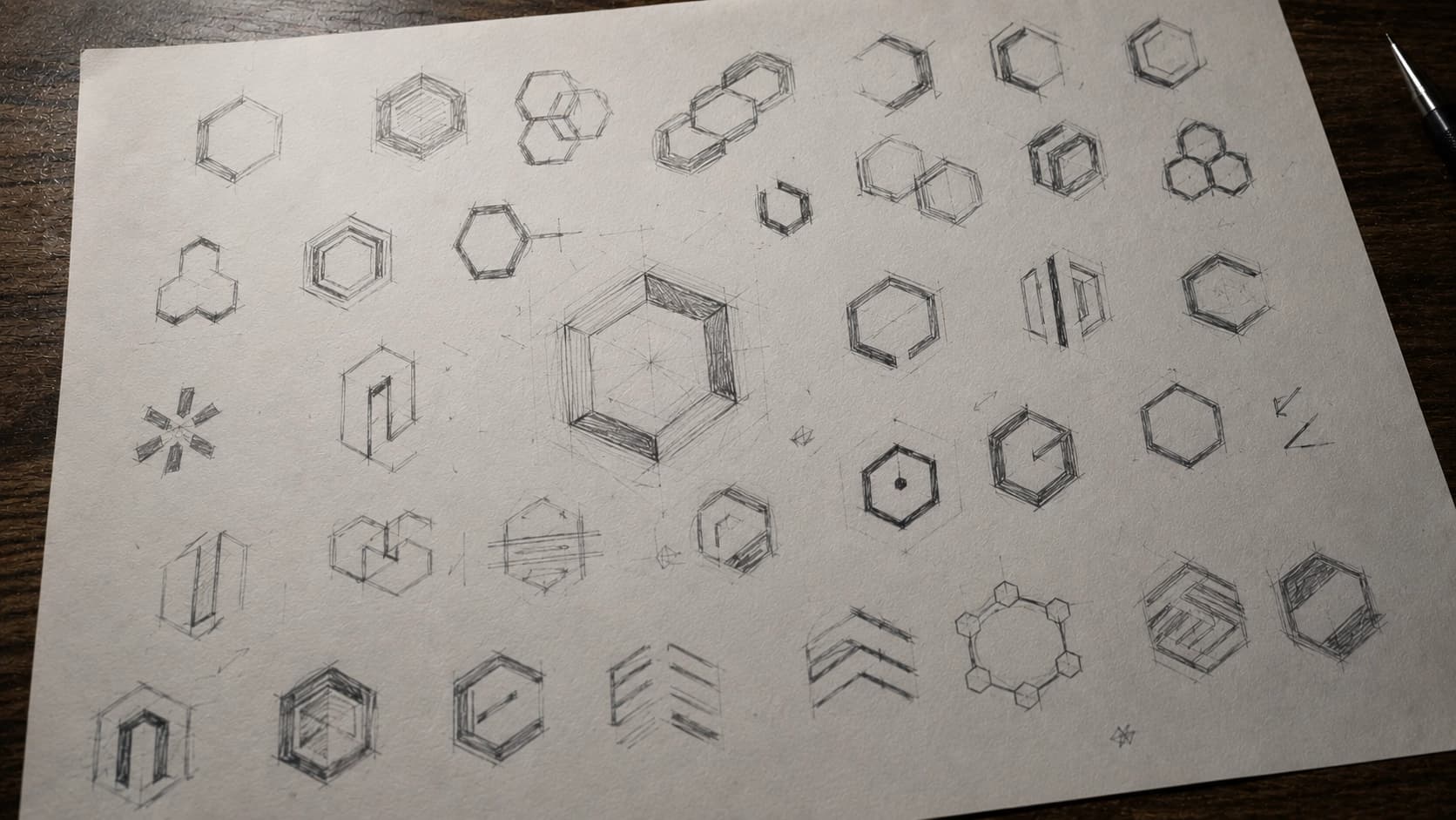
The symbol is a hexagon, for what it already means in this industry: network nodes and topology, load distribution, structural strength. One of the references I was given was a Lamborghini, for the hexagonal pattern on the wheels, and that thread runs all the way to the primary blue in the palette. The full construction is documented in a production-ready brand manual.
The system had to hold up off screen, which is where an identity falls apart. I produced the flyers and print pieces with it, the large-format banners, the ESL product labels, the bilingual sales decks, the HTML newsletters, the email signature library, a vehicle wrap, and the stand design for an industry trade show. Each piece is a different test: at trade-show scale, on a moving vehicle, on a physical label, in somebody's inbox.
I built the site in Astro with Tailwind, structuring content around each division so the same base data feeds the home page, the division pages, and every product view without duplicating anything by hand. It is bilingual with light and dark mode, switching without a reload, and wired into the CRM the company already used, so an enquiry enters the sales pipeline instead of dying in a form.
Technologies
- Framework: Astro
- Styling: Tailwind CSS
- Design tools: Figma, Adobe Illustrator
- Integrations: Company CRM, HTML newsletter
- Focus areas: Brand identity, sub-brand system, bilingual UI/UX, front-end implementation